

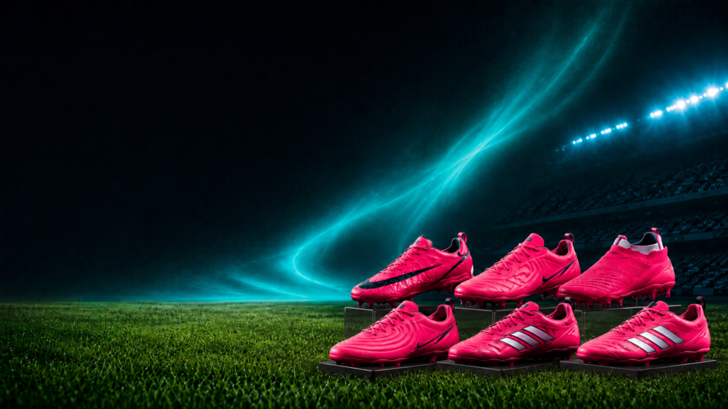
We’re watching this 2026 World Cup as neutral spectators: with no Chilean team on the field, we’re free to notice other things. And there’s one detail that repeats match after match, no matter the national team: the feet.
Not the ball, not the jersey. The feet. There’s an extremely high chance that, regardless of the team, position, or brand, you’ll come across exactly the same thing: pink soccer cleats. Fuchsia, magenta, electric pink, whatever you want to call it. But pink.
And here’s the fun part: nobody coordinated. There was no joint campaign, it wasn’t a FIFA requirement, it’s not superstition. Nike, Adidas, Puma, New Balance, and even Skechers arrived independently (each with its own team, its own brief, and its own reasoning) at the very same color. The result? An entire World Cup dyed pink, and one of the juiciest marketing paradoxes this World Cup has given us.
Spoiler: the move each brand designed to stand out ended up making them all look the same. And there’s a lot to learn from that.
First things first: why pink?
To understand the phenomenon, you need to look at where the brand actually lives on the field. The national team jersey is tied up in the federation’s contract: that space can’t be touched. So what’s left for a player to showcase their personal sponsor? The feet. Soccer cleats are one of the few individual showcases a player has during the most-watched event on the planet.
And if you’re going to compete for that attention, the data rules. Pink offers one of the highest contrasts against the green of the grass, which boosts visibility in HD broadcasts, replays, social media clips, and press photos. Add one more detail that’s not minor: none of the 48 national teams in this World Cup uses pink as the dominant color on its jersey. Wide open field.
Odinga Nimako, from Nike’s global soccer footwear development team, explained it to The Athletic: the idea was for the cleat to stand out against the uniform, and players themselves had been asking for more vibrant colors because, according to them, they give them confidence in decisive moments. In other words: in the attention economy, a soccer cleat no longer just needs to look good on the field. It has to work in the photo, in the 15-second clip, and on the phone screen. Visibility has become an incredibly expensive asset, and color is the cheapest tool to get it.
The detail that went viral: the “creative commodity” trap
The phenomenon jumped from the field to social media when several marketers started noticing it, among them João Branco, former VP of Marketing at McDonald’s Brazil, whose post sparked the conversation (and, incidentally, inspired this article). The irony everyone pointed out was the same: the plan was to draw attention to the brand, but the move ended up drawing attention to the color instead. The entire World Cup turned pink.
And that has a technical name: creative commodity. It happens when products born to stand out start following the same visual patterns as the competition and, without realizing it, erode the very thing that made them exclusive. That’s the underlying paradox of this whole pink World Cup: when differentiation becomes the norm, it stops differentiating. What was supposed to be each brand’s signature ended up becoming the category’s generic color.
There’s a tasty way to understand it. Imagine if Easter only happened once every four years and every trend report agreed that pistachio was the flavor of the moment: it would be perfectly natural for half the industry to launch pistachio eggs at the same time — not because they copied each other, but because they were reading the same map. Pink, in this World Cup, was the pistachio: the safe bet everyone saw coming at the same time.
How they all end up in the same place (without copying each other)
Here’s the part that really matters for those of us who work in this field: the convergence happened without collusion. Nobody copied anybody. They simply all read the same cultural signal… and often the same report.
A large part of the sportswear industry draws on the same trend-forecasting agencies and, increasingly, the same AI tools to track where desire is heading. If they all start from the same diagnosis, it’s no surprise they arrive at the same answer.
There’s an extra factor that tightens the coincidence: the World Cup is the ultimate showcase, but it only happens once every four years. That forces brands to concentrate their chips on a few “hero products,” those models that carry the technological and brand message for the whole season. When everyone bets big on a single flagship product, reading the same data, convergence stops being a coincidence and becomes almost inevitable.
The plot twist: the “flaw” that ended up being good business
And here’s where it gets good. Because yes, as a differentiation play, things backfired: instead of each brand standing out, they camouflaged themselves among each other. But the whole category came out winning.
Centauro, one of Brazil’s major sporting goods retail chains, reported an almost 50% jump in sales of pink soccer cleats since the World Cup kicked off. The reason? Seeing dozens of the world’s best players wearing the same shade created an incredibly powerful association: the stars wear pink. Without meaning to, the brands jointly manufactured a status signal that none of them could have achieved alone.
Branco sums it up perfectly: now the consumer’s question is no longer which color to buy, but which brand. And that’s where the marketing job flips entirely: the challenge becomes convincing you that this particular pink is different from the rest, whether through technology, attitude, or the story built around it.
So what do we take away from all this?
The pink soccer cleat is a perfect parable of the attention economy. When everyone optimizes for the same metric (contrast against the green, visibility on screen) using the same data and the same trend reports, everyone lands in the same spot. And differentiation evaporates exactly where it was supposed to appear.
The moral isn’t “don’t follow trends.” It’s that the trend, the color, the format, whatever the pistachio of the moment is, is the ticket to enter the conversation, not what wins it. Real differentiation was never going to live in the shade of pink. It lives in the story you build around it.
There’s a marketing classic about not competing in the red ocean full of sharks. Well, this World Cup gave us a debut: the pink ocean, and everyone dove in at the same time. The brand that wins this World Cup off the field won’t be the one with the pinkest cleat. It’ll be the one that gives us a reason to remember whose foot it was on.
And since the Chilean team didn’t give us anything to talk about this World Cup, at least the marketing did.
Sources
[1] Exame — “Especialistas explicam como a chuteira rosa virou o ‘pistache’ do marketing esportivo”
[2] SAPO — “Por que tantos jogadores usam chuteiras rosas na Copa do Mundo de 2026”
[3] The Athletic / The New York Times — “Por que tantas chuteiras cor de rosa na Copa do Mundo 2026”, via Portal Jornal do Norte
[4] ND Mais — “Chuteiras rosas na Copa: entenda a nova tendência”
[5] CNN Brasil — “Chuteiras rosas dominam a Copa do Mundo”
[6] Original post by João Branco (@falajoaobranco) on Instagram