

Brand Book Alyan
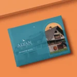
A family winery is bought by looking at a label on a shelf, before tasting the wine. Alyan needed that moment to work in its favor. Maggiore developed the complete brand manual: a logo with the little bird as its central symbol, color palette, typography, graphic resources, and photographic treatment, applied to the label as well as to corporate communication and social media. The system protects what Alyan really is, a winery with a family history, without resorting to the category's worn-out codes: ornate serifs, grape clusters, sunsets.
Team that participated
Document
📄
Cargando documento…